The Build graphic is a powerful visual editor that lets you create completely custom broadcast graphics from scratch. With an intuitive drag-and-drop interface and professional styling controls, you can design lower thirds, scoreboards, message banners, and any other graphic you can imagine: no coding required.
Getting started
To create a new Build graphic:
Add a Build graphic to your H2R Graphics project
Choose to start from a blank canvas or select one of the pre-built templates
Add items using the Rectangle, Text, or Image elements
Position and style your items using the canvas and sidebar controls
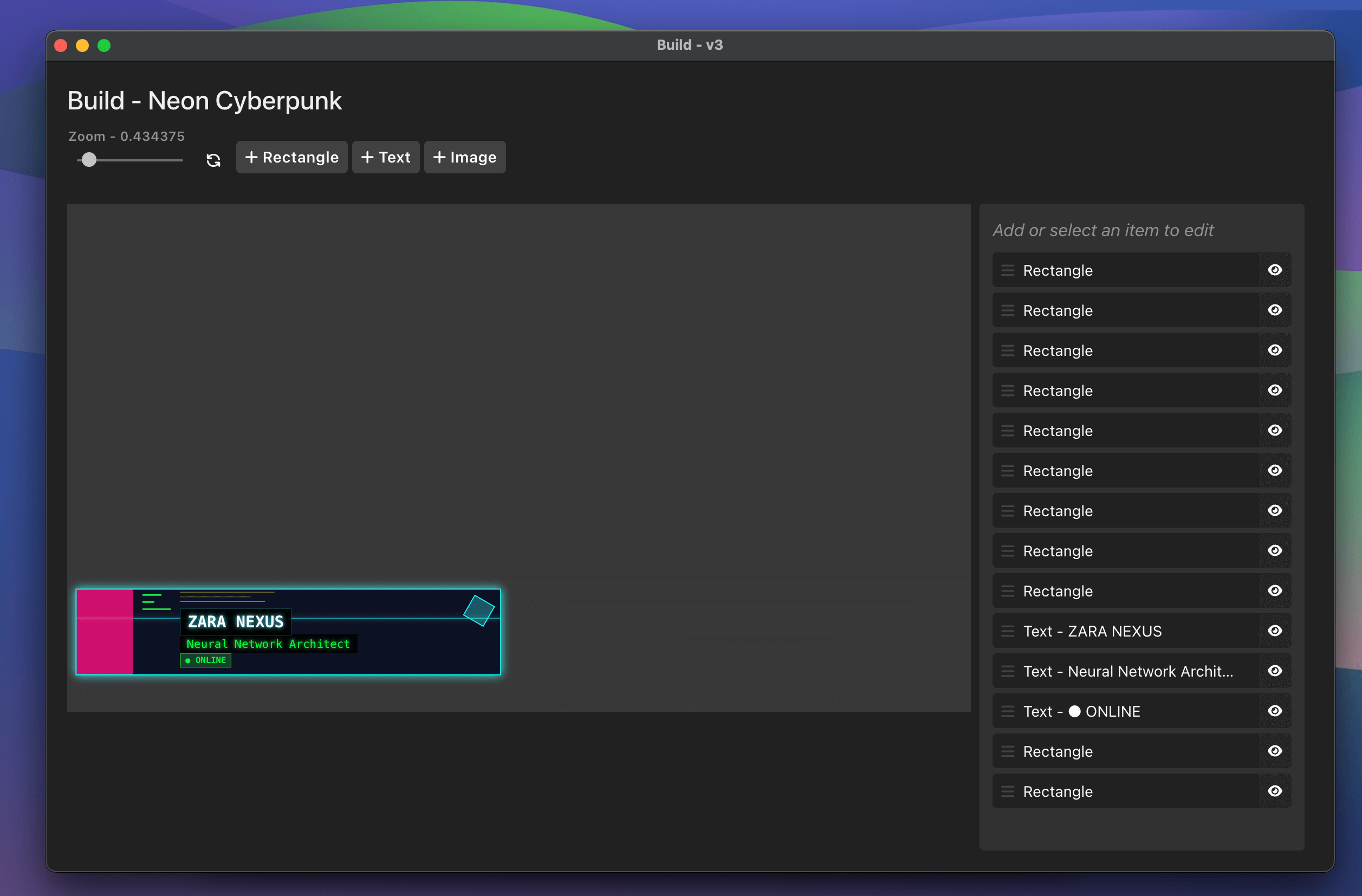
The Build graphic interface with canvas and sidebar
The Canvas
The Build graphic uses a 1920×1080 pixel canvas (16:9 aspect ratio) that matches standard broadcast dimensions. The canvas features real-time preview, drag-and-drop positioning, and zoom controls for precise editing.
Zoom Controls
Located in the top-right corner of the canvas:
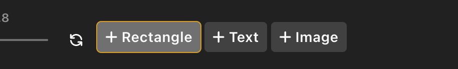
Zoom slider: Adjust from 20% to 400% in 20% increments
Fit button: Automatically calculates the optimal zoom level for your screen
Percentage display: Shows current zoom level
Using zoom controls to edit fine details
Item Types
Rectangle
Rectangles are versatile shapes perfect for backgrounds, accent bars, dividers, and decorative elements.
A rectangle configured as a background element
Available Settings:
Background Color: Full color picker with transparency control (RGBA)
Position: X and Y coordinates in pixels (can be negative to position off-canvas)
Size: Width and height from 0 to 100,000 pixels, or “auto” for content-based sizing
Rounded Corners: Global border radius setting (0-10,000 pixels)
Individual Corner Rounding: Separate controls for top-left, top-right, bottom-right, and bottom-left corners
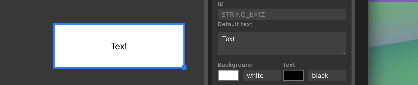
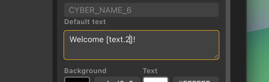
Text items are editable text fields that support rich formatting, custom fonts, and dynamic content through data source variables.
A styled text item with custom font and colors
Available Settings:
Content:
ID: Optional identifier for linking to data sources
Default Text: Multi-line text area with support for line breaks and formatting
Typography:
Font Family: Enter any installed font name (defaults to Arial)
Font Size: 1 to 10,000 pixels
Font Weight: Bold toggle button (B)
Font Style: Italic toggle button (I)
Text Decoration: Underline toggle button (U)
Colors:
Background Color: Full color picker with transparency
Text Color: Full color picker
Alignment:
Horizontal Alignment: Left, Center, or Right
Vertical Alignment: Top, Center, or Bottom
Layout:
Position: X and Y coordinates
Size: Width and height (use “auto” for dynamic sizing based on content)
Padding: Internal spacing controls
Rounded Corners: Global and individual corner controls
Opacity: Transparency control
Text Formatting Syntax:
Text items support inline markdown-style formatting:
**bold text** - Makes text bold*italic text* - Makes text italic__underline__ - Underlines text~strikethrough~ - Adds strikethrough\n - Inserts a line break
Example:
**BREAKING NEWS**\nStorm warning in effect
Renders as:
**BREAKING NEWS**Storm warning in effect
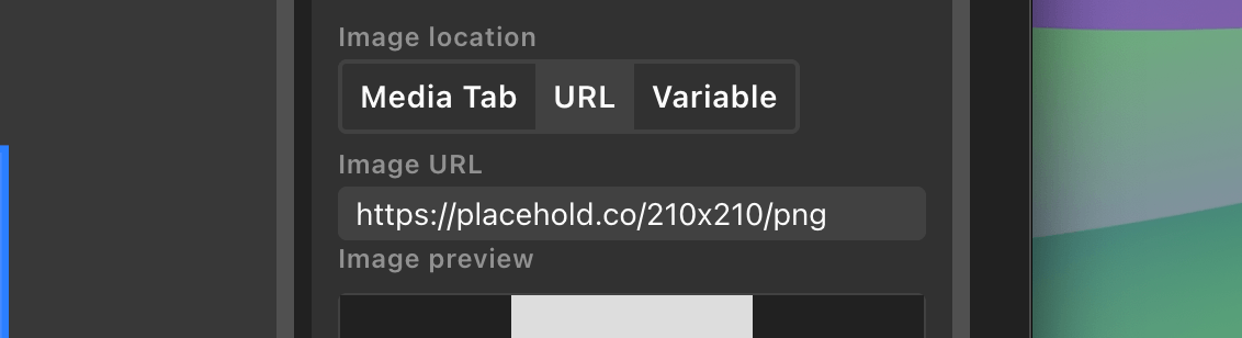
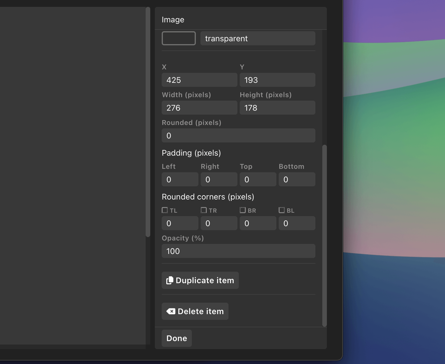
Image
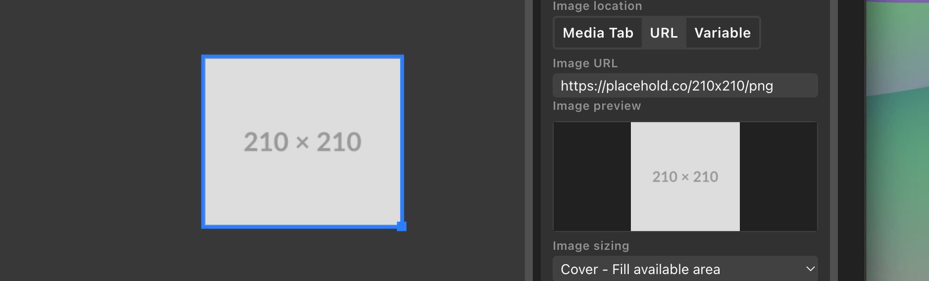
Image items display logos, photos, graphics, and other visual media from multiple sources.
An image configured with “contain” sizing
Image Source Options:
You can pull images from three different sources:
Media Tab: Select from images uploaded to your project’s media library
URL: Enter a direct link to an online image (e.g., https://example.com/logo.png)
Cover: Fills the available area, cropping if necessary to maintain aspect ratio
Contain: Fits the entire image within the area, adding letterboxing if needed
Background Color: Visible when using “contain” sizing or with transparent images
Layout:
Position: X and Y coordinates
Size: Width and height in pixels
Padding: Internal spacing
Rounded Corners: Create circular logos or rounded image frames
Opacity: Transparency control
Common Uses:
Team logos for scoreboards
Headshots for lower thirds
Product images for showcases
Brand logos and watermarks
Weather icons
Positioning and Resizing Items
Drag to Position
Click and drag any item on the canvas to reposition it. Items can be positioned anywhere on the 1920×1080 canvas, or even off-canvas using negative coordinates.
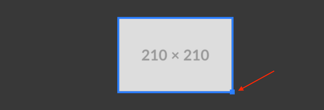
Resize Handle
When an item is selected, a blue square appears in the bottom-right corner. Click and drag this handle to resize the item.
Normal resizing: Drag freely to adjust width and height independently
Aspect ratio lock: Hold Shift while dragging to maintain the item’s proportions
Resizing an item while holding Shift to maintain aspect ratio
Selection Indicators
Selected items: Display a 4-pixel blue ring
Hovered items: Display a lighter blue ring
Multiple selection: Select an item by clicking it, or click the canvas background to deselect all
Link a rectangle’s size to text
A rectangle can automatically resize to fit a text item, so a background bar or pill always wraps its label no matter how the text changes. This is ideal for lower thirds and message banners where the text length varies.
To set it up:
Select a Rectangle item.
Open the Link size to text section below the Width and Height fields.
Choose a text item under Width follows and / or Height follows.
Linking a rectangle’s width and height to a text item
Width and height are linked independently, so you can link just one or both, and each can follow a different text item if you like. While a dimension is linked, its Width or Height field shows linked and is driven by the text rather than a fixed value.
Use the Pad fields to add space around the text. The X pad adds space on the left and right, and the Y pad adds space on the top and bottom, so your rectangle sits a little larger than the text it follows. Padding can be negative to make the rectangle tighter than the text.
Tip: Giving your text item an ID makes it easy to recognise in the “Width follows” and “Height follows” dropdowns.
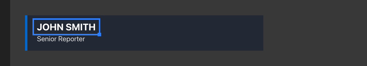
The Sidebar
The sidebar on the right side of the interface serves two purposes: editing individual items and managing layers.
Editing an Item
When you select an item on the canvas or from the layer list, the sidebar displays all available settings for that item.
Editing a text item in the sidebar
The sidebar includes:
Header: Shows the item type (Rectangle, Text, or Image)
Item-specific settings: Properties unique to that item type
Divider
Shared settings: Properties available to all items (position, size, padding, corners, opacity)
Duplicate button: Creates a copy of the item offset by 20 pixels
Delete button: Removes the item from the canvas
Done button: Returns to the layer list view
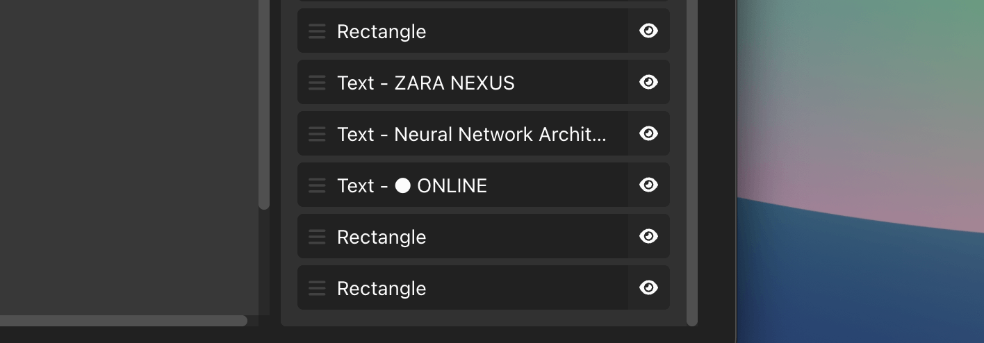
Layer List
When no items are selected, the sidebar shows a list of all items in your graphic.
The layer list showing multiple items
Each layer entry displays:
Drag handle: Six-dot icon for reordering
Item preview: Type name and content preview (e.g., “Text - AWAY Team”)
Visibility toggle: Eye icon to show/hide the item
Understanding Layer Order:
The layer list represents the z-index or stacking order of your items:
Items at the top of the list render behind other items (back layer)
Items at the bottom of the list render in front of other items (front layer)
Dragging to reorder layers
Show/Hide Layers
Click the eye icon next to any item to hide it from the canvas. Hidden items:
Don’t render on the canvas or in the final output
Still appear in the layer list (with reduced opacity)
Can be shown again by clicking the eye icon
Remain in the graphic’s data
Using the visibility toggle
Keyboard Shortcuts
Item Management
Delete or Backspace: Delete the selected item(s)
Disabled when typing in input fields
Undo/Redo
Ctrl+Z (Windows) or Cmd+Z (Mac): Undo the last change
Ctrl+Shift+Z or Cmd+Shift+Z: Redo a change
History limit: Up to 100 actions
Undo/redo works for:
Moving items
Resizing items
Changing properties
Creating and deleting items
Duplicating items
Mouse Interactions
Click item: Select it for editing
Click canvas background: Deselect all items
Drag item: Move it to a new position
Drag resize handle: Resize the item
Shift + Drag resize handle: Resize while maintaining aspect ratio
Data Source Integration
One of the most powerful features of the Build graphic is the ability to connect text and images to data sources, making your graphics dynamic and automatically updated.
Text Variables
Text items support variable replacement using bracket syntax. When the graphic is on-air, these variables are replaced with actual values from your data sources.
Basic Text Variable:
[text.1]
Example:
If you have a data source with a text.1 field set to “John Barker”, the text:
Welcome [text.1]!
Renders as:
Welcome John Barker!
Using variables in text items
List Variables
Access data from dynamic lists using this format:
[list1.row1.cell1]
Example:
[list1.row1.cell1] - [list1.row1.cell2]
This might render as:
Marcus Johnson - 23 Points
Graphic Data References
Pull data from other graphics in your project:
[GRAPHICID.property]
Example:
Current: [ABC12.line_one] - [ABC12.line_one]
Special properties for social graphics:
[GRAPHICID.current_comment] - The current chat message
[GRAPHICID.current_author] - The comment author’s name
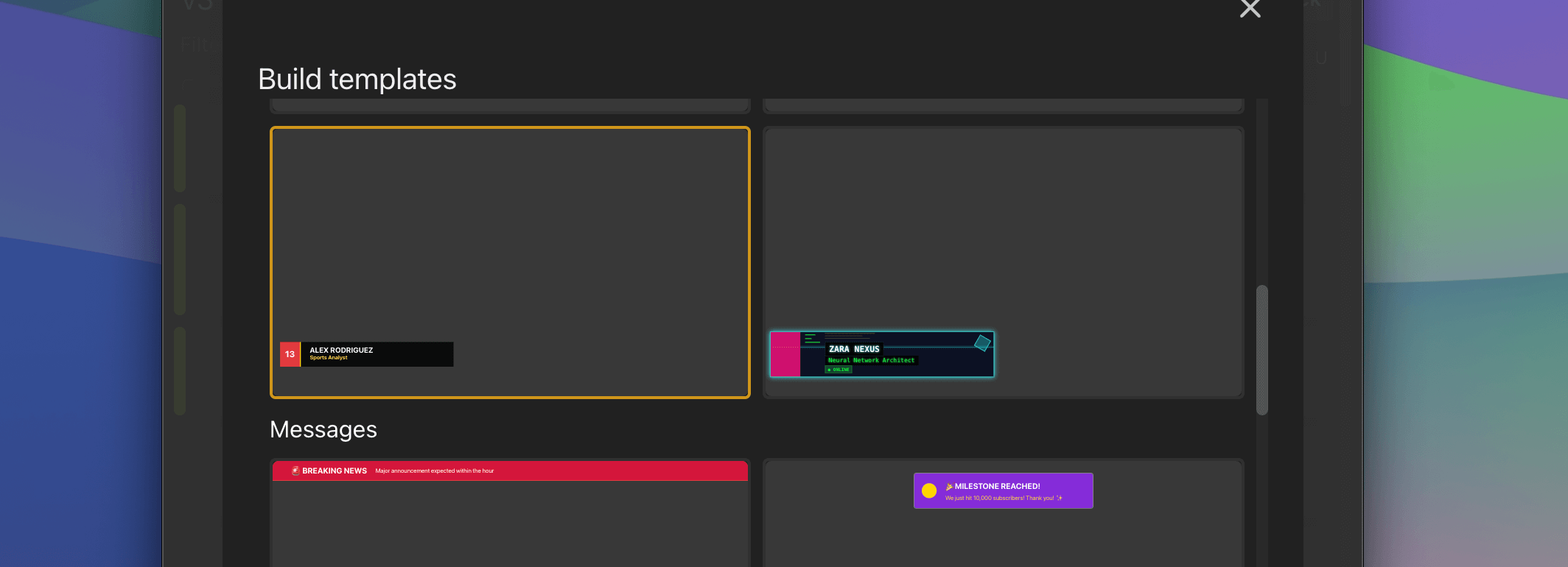
Pre-built Templates
To help you get started quickly, the Build graphic includes professionally designed templates across multiple categories.
Simple Templates
Blank: Empty canvas for complete creative freedom
Center Text: Centered text block with semi-transparent background
Lower Third Templates
Perfect for identifying speakers, players, or interview subjects:
Classic News: Traditional broadcast news style with blue accent stripe
Modern Minimal: Clean geometric design with orange accent
Corporate Pro: Professional multi-layer gradient look
Sports Style: Dynamic design with bold colors and number accents
Elegant Broadcast: Sophisticated serif typography with gold accents
Neon Cyberpunk: Futuristic style with glowing borders and circuit patterns
Various lower third template styles
Message Templates
For notifications, alerts, and announcements:
Breaking News: Top banner with red background
Live Status: Top-right indicator with viewer count
Starting Soon: Centered pre-show countdown
Important Update: Bottom banner for announcements
Social Message: Chat/comment display card
Event Alert: Centered milestone notification
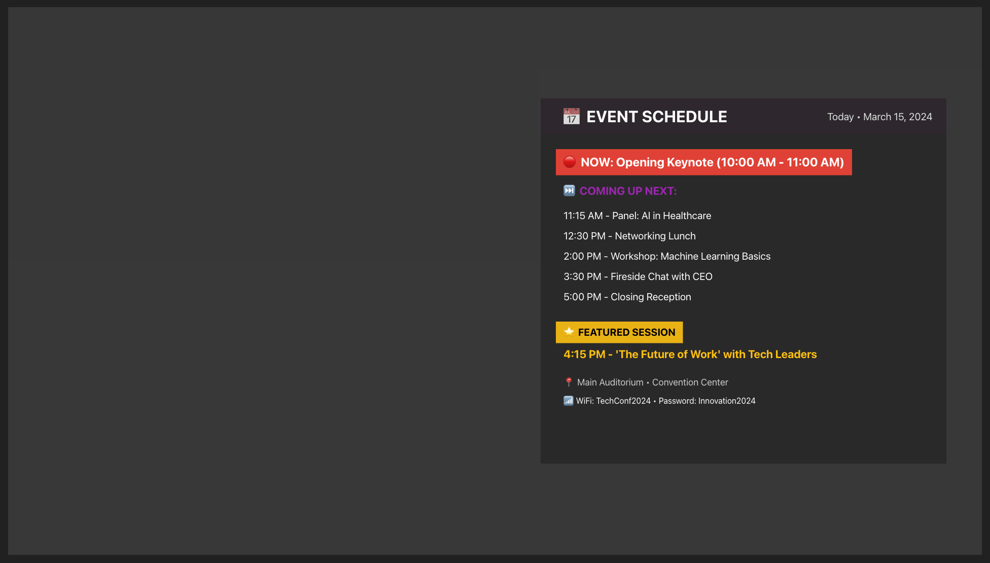
Panel Templates
Large feature graphics for in-depth information:
Player Spotlight: Sports player profile with stats
Next Speaker: Conference speaker introduction
Weather Report: Weather conditions with 5-day forecast
Product Showcase: Product features with specs and pricing
Guest Interview: Interview subject with credentials
Event Schedule: Timeline of upcoming activities
A panel template configured for player spotlights
Each template is fully customizable. Use them as starting points and modify any aspect to match your brand.
Export and Import
You can export and import your custom Build graphics, making it easy to share your creations with colleagues, back them up, or move them between machines.
Exporting a Build Graphic
To export a Build graphic, open the graphic editor and use the Export option. This saves the graphic as a file you can share or store.
Importing a Build Graphic
To import a Build graphic, use the Import option when adding a new graphic. Select the exported file and the graphic will be added to your project with all its items, styles, and settings intact.
Common Workflows
Creating a Custom Lower Third
Click Rectangle to create a background bar
Set the background color, position (e.g., x: 0, y: 920), and size (e.g., 800×160)
Add rounded corners if desired
Click Text to add a name field
Position the text over the rectangle
Style the text with your chosen font, size, and color
Add an Image item for a logo
Position and resize the logo
Use the layer list to ensure proper stacking order
Creating a custom lower third graphic
Tips and Tricks
Precise Positioning
Use the sidebar’s position inputs to enter exact coordinates
Set position to x: 0 to align with the left edge
Set position to y: 0 to align with the top edge
Use negative values to position items partially off-canvas
Efficient Duplication
When creating multiple similar items:
Style the first item completely
Click Duplicate item
Modify only the content or position
Repeat for each additional item
This is especially useful for:
Multiple text fields with the same styling
Repeated decorative elements
Team information that mirrors on both sides
Creating Transparent Overlays
Add a Rectangle covering the entire canvas (1920×1080)
Set the size to width: 1920, height: 1080, and position to x: 0, y: 0
Choose a background color
Reduce the opacity to 40-60%
Use the layer list to move it behind your text items
Background Images
While there’s no dedicated “background image” type, you can achieve this:
Add an Image item
Set size to 1920×1080
Set position to x: 0, y: 0
Set Image Sizing to “Cover”
In the layer list, drag it to the top (behind all other items)
Troubleshooting
My text isn’t wrapping:
Set a specific width for the text item (don’t use “auto”)
Text will automatically wrap within the defined width
Items are in the wrong order:
Use the layer list in the sidebar to reorder items
Remember: items at the top of the list render in front of items at the bottom
Variables aren’t showing values:
Ensure you’re viewing the graphic in an output
Check that the data source is properly connected
Verify the variable syntax: [text.1]
Can’t select an item:
It might be hidden behind another item, use the layer list to select it
Check if it’s been hidden using the eye icon
Try zooming in if items are very small
Resize handle isn’t appearing:
Make sure the item is selected (blue ring around it)
The handle appears in the bottom-right corner
Hidden items don’t show resize handles
Simplify your graphics workflow
Start using graphics on your live stream or video productions.