
🆕 New in Version 3.5
Element animations, a Timer element, 37 new Build templates and more...
See what's new →🆕 New in Version 3.5
Element animations, a Timer element, 37 new Build templates and more...
See what's new →By John Barker • 18 November 2026
Graphics made in Build can now move. Every element in your design, whether it’s a rectangle, a line of text or an image, can animate on and off with its own fade, slide or wipe.
Animations are set on the new Animation timeline at the bottom of the builder. Every element gets its own row, with a dropdown to pick its effect, such as Slide up, Slide from left, Wipe up or Wipe right. Drag a block along the timeline to change when that element starts, and drag its end to change how long it takes.
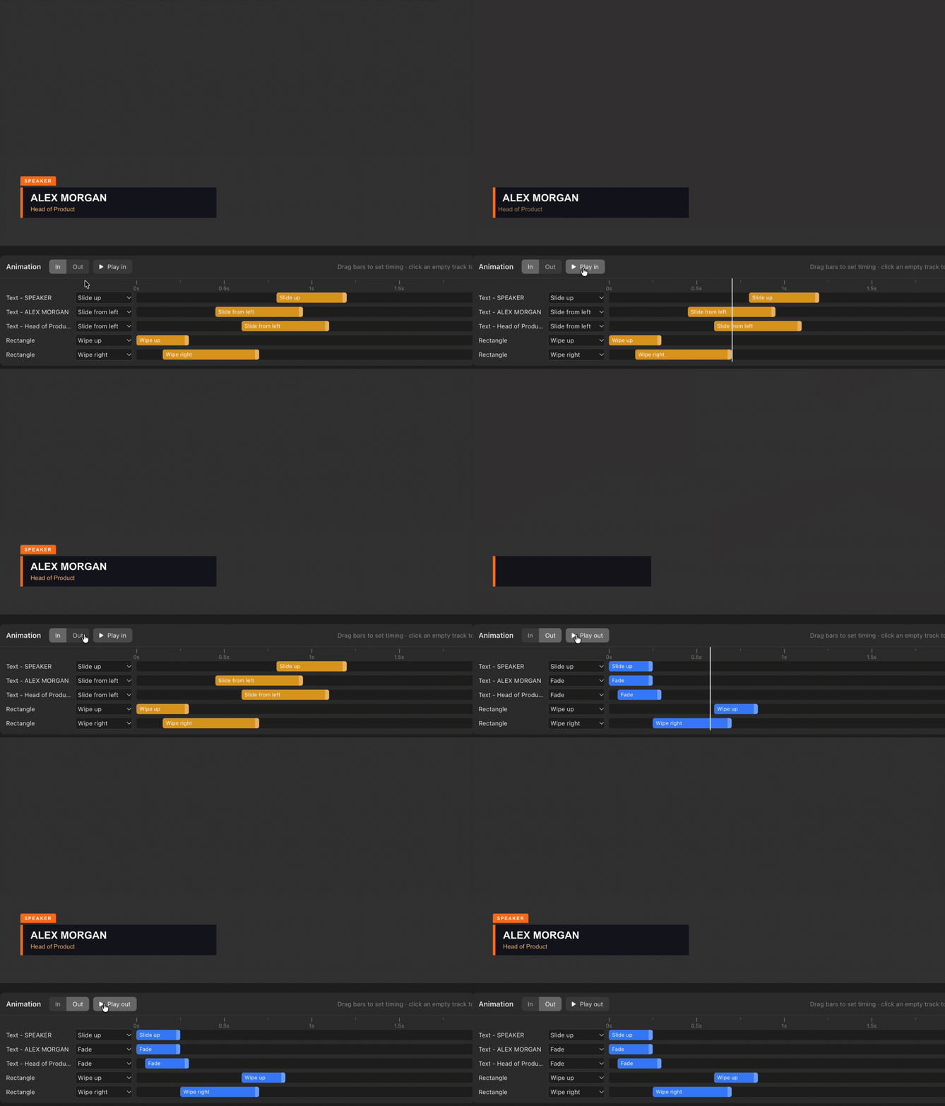
In the lower third above, the background wipes up first, the orange accent wipes across, the name slides in from the left, the job title follows a beat later, and the SPEAKER tag slides up last. All of that took a few drags.
Switch between In and Out to set how elements arrive and how they leave, each with its own timing. Hit Play in or Play out to preview the whole thing right in the builder, without sending anything to air. Animations use a smooth ease-in-out curve, so even simple moves look polished.
It means the layered, staggered builds you’d normally need a motion graphics app for can now be made in a couple of minutes, inside H2R Graphics.
Learn more about animations on our documentation.
Build has a new Timer element. Add one to any design and pick what it shows:
Timers are styled just like text, so you get the same fonts, colours, sizes and padding you already use. Rectangles can link their size to a Timer too, so a background box grows and shrinks to fit as the digits change.
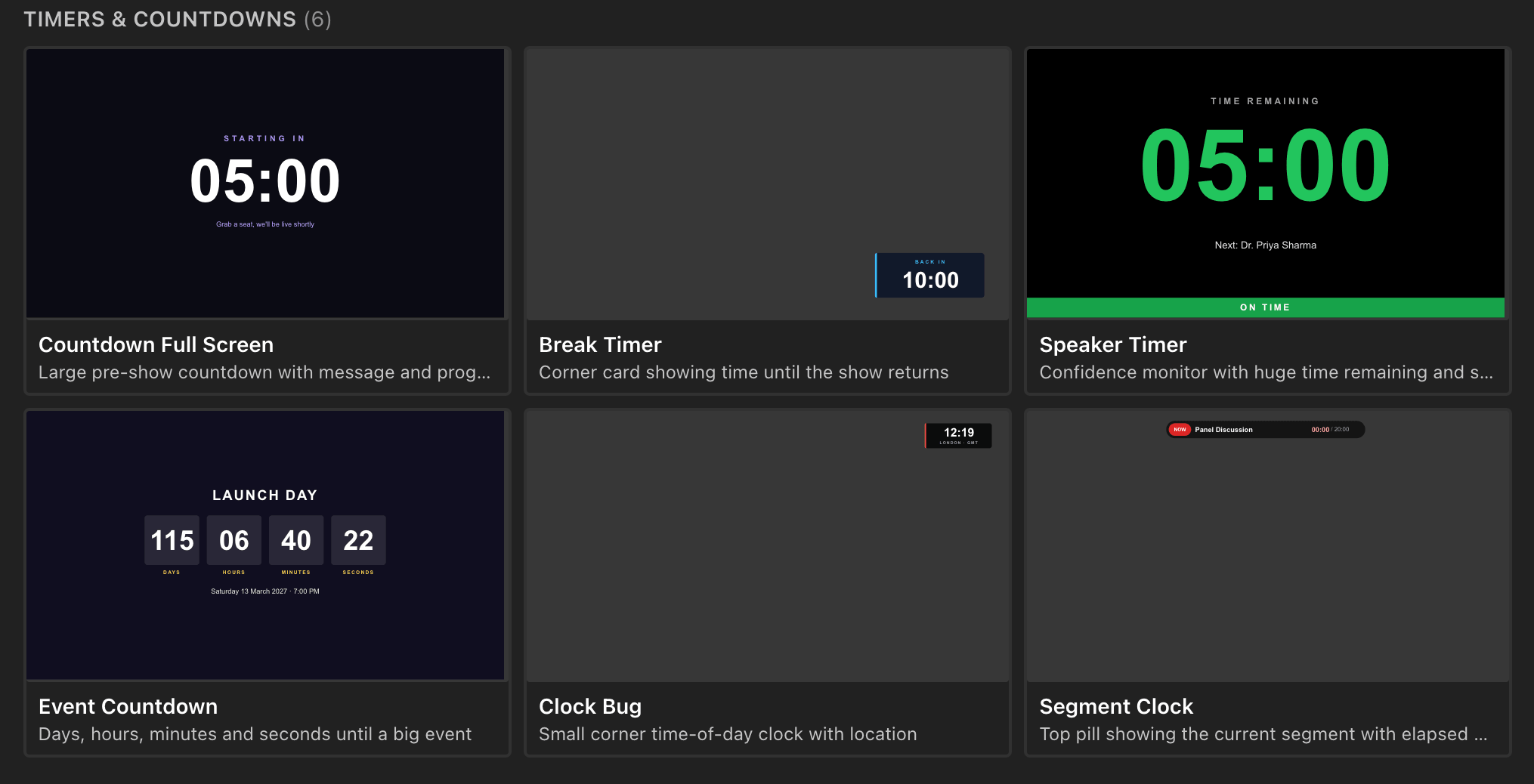
To get you started, there’s a whole category of Timers & Countdowns templates built with it: a full screen pre-show countdown, a corner break timer, a speaker timer confidence monitor, an event countdown with days, hours, minutes and seconds, a time of day clock bug, and a segment clock showing elapsed time.
Countdown screens, break timers, speaker clocks and clock bugs can now live in the same design as the rest of your branding.
Learn more about the Timer element on our documentation.
Build now ships with 57 templates, including 37 new ones across six new categories:
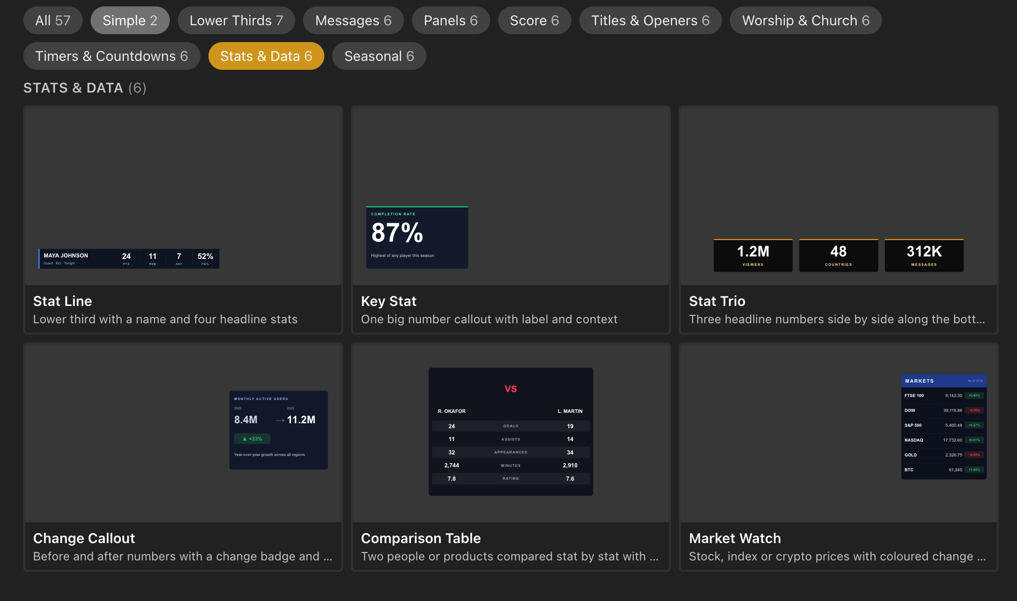
Every new template comes with animations already set up, so they look great the first time you take them to air. Pick one, swap in your colours and fonts, and you’re done.
You can browse them all on our Build templates page.
Already started a design and want to try a different look? The new Replace with template button in the builder toolbar swaps your current design for any template. Changed your mind? Press Cmd/Ctrl+Z to undo.
Graphics that you control live now have a control strip underneath them on the rundown. The left side shows where the graphic is right now, in big, easy to read type, and the controls you need sit right next to it. No more opening a graphic just to nudge it along.
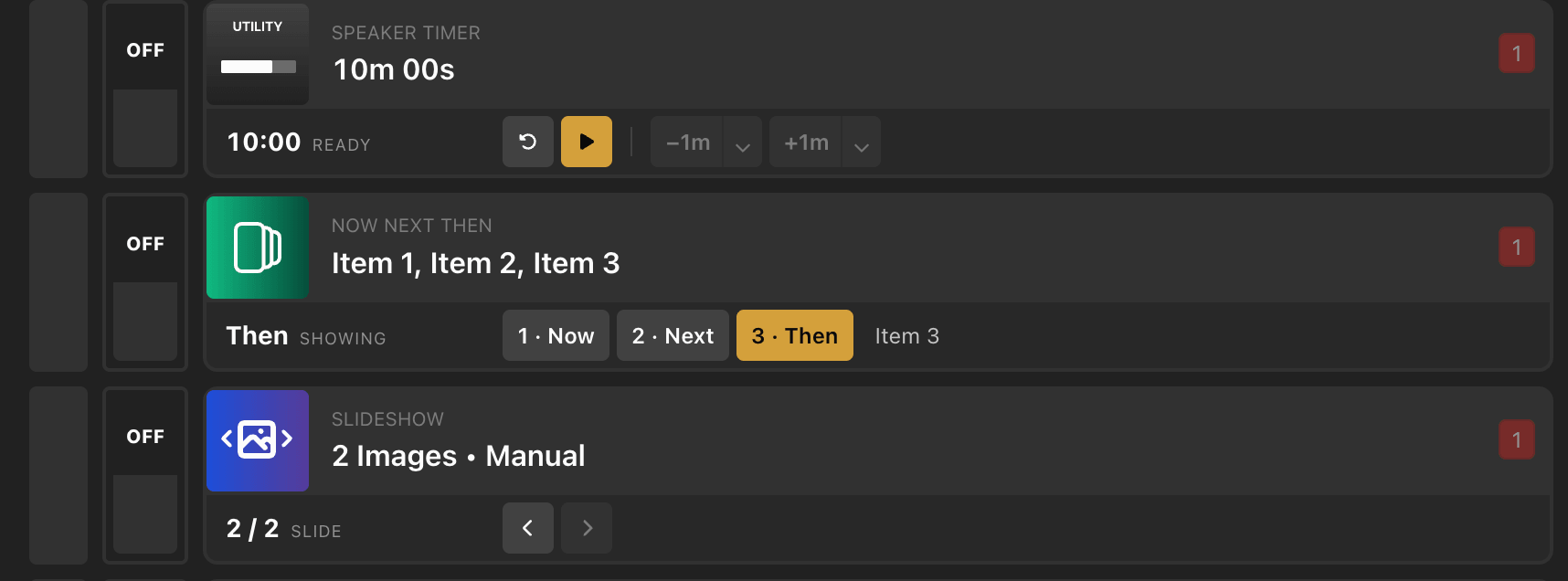
What’s in the strip depends on the graphic:
The strip doesn’t get in the way of rearranging your show either. Pressing a control in the strip no longer starts dragging the row.
Output badges now sit in fixed columns, so they line up all the way down the rundown and you can see at a glance which graphics are on which output. Hover a badge for a tooltip listing every output that graphic is on.
List arrows got smarter too. They now work with list variables in any of a graphic’s text fields, not just the first line. If a graphic uses more than one list, you can pick which list the arrows step through.
Learn more about the control strip on our documentation.
The Control Room has a cleaner layout. Preview and Output now sit together in one panel, stacked one above the other, with their labels above the picture rather than over it, so nothing covers your graphics.
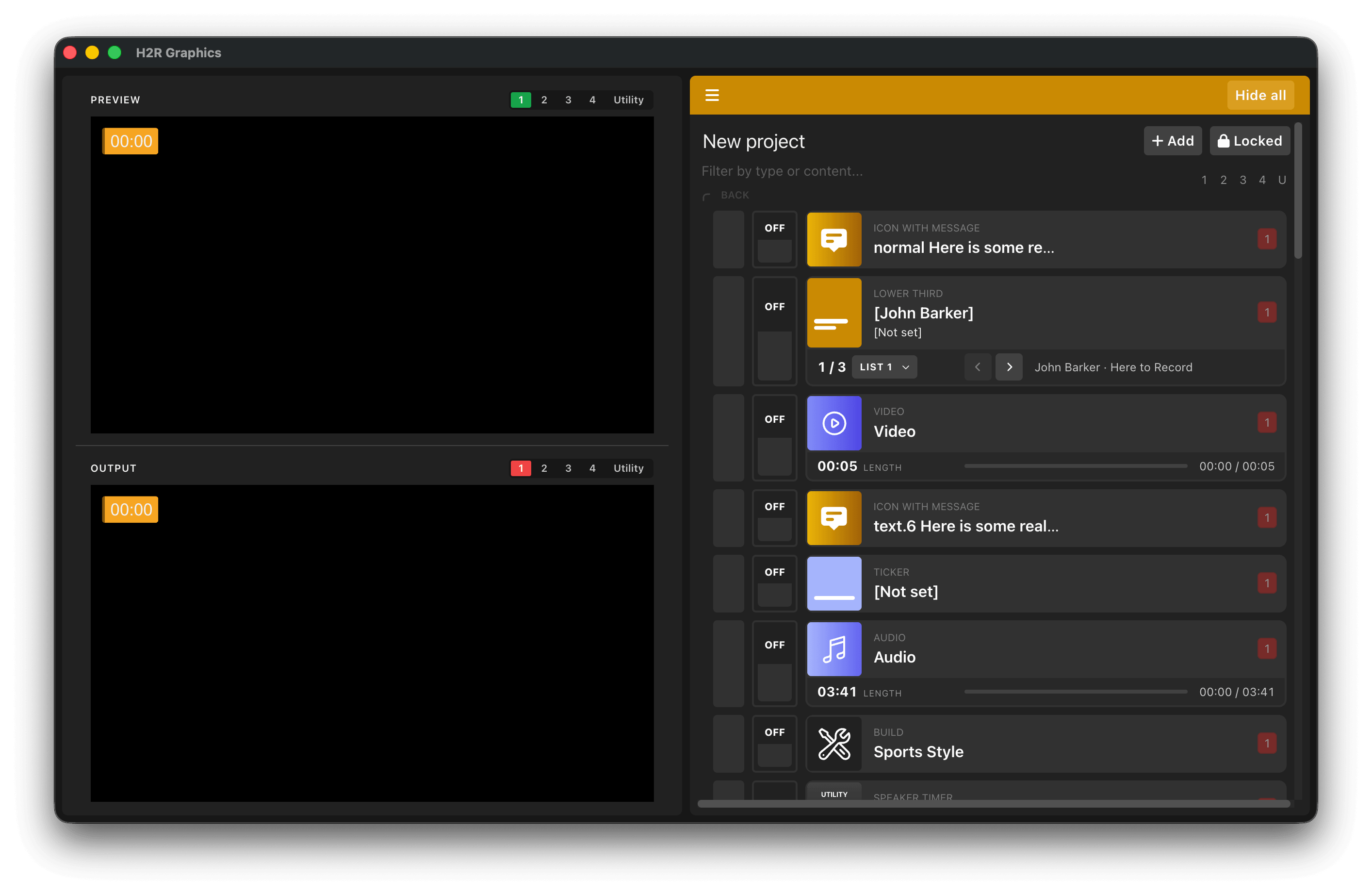
A new 1 / 2 / 3 / 4 / Utility selector lets you choose which output Preview shows, which makes multi-output shows much easier to check before you go live.
Learn more about the Control Room on our documentation.
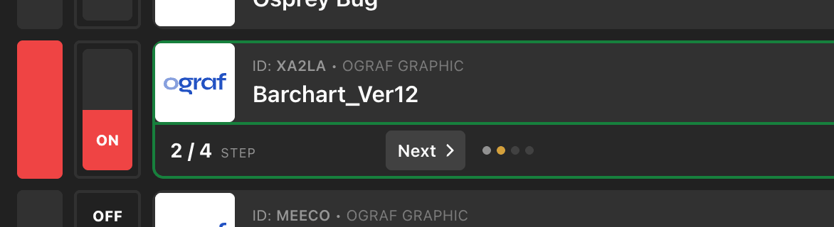
OGraf graphics that have more than one step can now be advanced with a Next button right on the cue, in the new control strip. A step counter (for example 2 / 4) and a row of dots show exactly where you are, so you always know what’s coming next.
OGraf fields marked as multi-line now get a proper multi-line text box in the graphic editor, and your text is passed to the graphic exactly as you typed it, new lines included. H2R Graphics also no longer adds its own fade-out on top of a graphic’s out-animation, so OGraf graphics play out exactly as their designer intended.
Learn more about multi-step OGraf graphics on our documentation.
Raspberry Pi 32bit (armv7l) builds have been removed in v3.5, as 32-bit ARM is no longer supported by Electron, the framework H2R Graphics is built on. If you’re running H2R Graphics on a Raspberry Pi, install Raspberry Pi OS 64bit and use the 64bit download.
Download v3.5 now and let us know what you think.
Simplify your graphics workflow
Start using graphics on your live stream or video productions.
Get H2R Graphics product updates
New features, releases and tips, straight to your inbox.
No spam. Unsubscribe any time.